Swiss-Style Poster
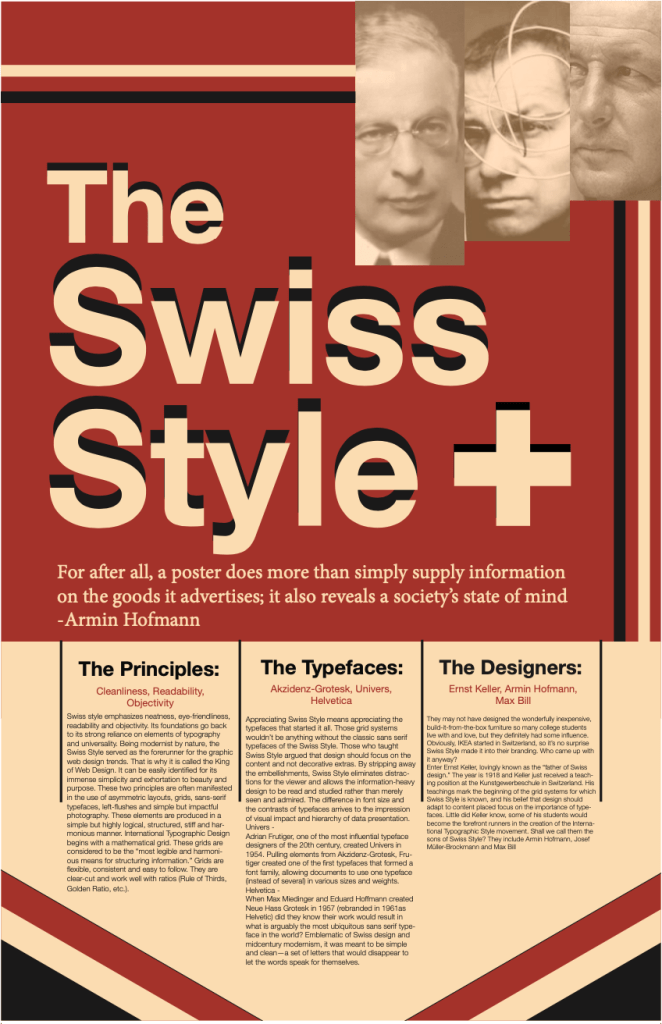
Task:
To create a poster that utilized the Swiss-Style and effectively used text hierarchy.
Program(s):
Indesign and Photoshop
Details:
For this assignment we were given one of our professor’s academic papers on the Swiss-Style. After reading, we had to take what we learned an apply it to a poster. Additionally, we had to organize all of the text that was within the paper to make it fit the poster.
One of the more obvious design decisions I made was to stick with only Swiss-Style fonts. I chose a simple & muted color palette to truly give the text and the fonts themselves the spot light. Keeping with the Swiss-Style, I let one large phrase, in this case the title of the poster, stand out. I felt like this helped me replicate the simplicity of the style while still including large amounts of text. For the content of the text itself, I chose to break each section into three categories. Each one received a title to help the viewer identify the information they may specifically be looking for. Additionally, each section was followed by a short list representing the content of the body text. This way a viewer could get the most important information without having to read the entirety of the body text. The body text followed but was separated by a partial barrier to help guide the viewer’s eye down and distinguish one section from the other.

